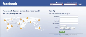
This semester has allowed my teammates and I to develop further skills on UI/UX designs throughout this semester. We’ve used concepts such as UI (User Interface) design and UX(User Experience). Throughout the semester we’ve had a major setback that led to our team being slightly behind schedule. Without the power of these design concepts we may not have been able to bounce back in so little time. UI design and UX design has allowed us to map out our ideas and create a more clear plan for us to start implementing our code and launching a plan of attack. My teammates and I decided to use a strategy of divide and conquer and pair programming. First things first is understanding what exactly UI design really is. If we look at the definition of this concept we know that UI design is the process of creating software, machines or appliances with a focus of efficiency and an aesthetic appeal which inhibits a user to have a good experience with the product. four main characteristics of User Interface design is looks, feel, responsiveness and interactivity. While thinking about design options there are many tools that can be used to find and pinpoint certain choices and highlight weaknesses or strengths of a design. Some other decisions to be made with User Interface design can be shapes, location of cursors or buttons, sizes and even color. For example, color plays a huge role when it comes to a user’s mood. So while designing the front end of a specific application we can manipulate a users emotion by just showing distinct color choices. So taking into account a social media giant such as Facebook. They chose to have their main login page a warm blue. Blue is known to evoke the feeling of trust and security into people hence why blue is a popular color. The color blue also highlights the idea of harmony and fluidity. Especially for a social media company that has contact information and messages and essentially a life record of someone one thing Facebook may have wanted was to have its users feel safe and secure posting on its platform.

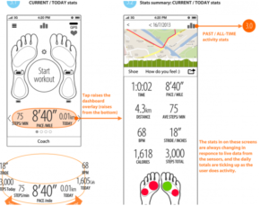
So now we get into UX design which is slightly different then UI design. UX design focuses more so on how the application works exactly. UX design is used to try to have a user friendly piece of software. The idea of UX design is to see what a user may want to do and make that process as simple as it possibly can be. UX design is how an application reacts and replies to a user. So there are specific tools that can be used to help identify these needs. Two of the most popular tools used in these design concepts are storyboards and wireframes. Wireframes is a myriad of sketches of a specific project in a specific stage of it in the design process. Every button would be labeling telling us how exactly this application may be used and hints as how specific design implementations were placed somewhere. For example, if we were to have a wireframe of a phone we could label the home button, maybe the volume buttons, the mute buttons etc. We would describe each functionality of every part of the phone. This can be a useful tool to see what other things a group of individuals maybe lacking in their design. wireframes are especially helpful in identifying strengths and weaknesses of a design.

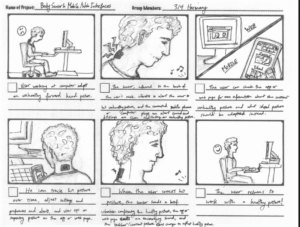
The second tool used are storyboards as mentioned earlier. Storyboards tell a story from the perspective of the user. This gives the developers ideas on how the application will be used or how the user may want to interact with that application. This highlights certain things about a design such as ideas as in “what if a user wanted to do “. The storyboard process allows developers to place themselves in the shoes of a user and instead of worrying about design elements such as colors or design choices in general can just worry about utility of an application.

Both these tools are useful in the design process because it allows all the developers involved to brainstorm in not so much a technical aspect but one of pure design choices which ultimately enhance the application. Without doing these certain techniques bugs and flawed ideas would be a lot more common. That’s why while designing an application whether it be in this course or any other time using UI design and UX design could help the team save time overall by just taking a little bit of time thinking of different scenario’s. Now once all design ideas were discussed and agreed upon the implementation is also key. As stated earlier in this blog my group and I decided to do a combination of conquer and divide and pair programming. Specifically for this blog I will be focusing more so on the side of pair programming. Pair programming has cons and pro’s to them, for instance pair programming for the most part is when two individuals work on the same thing together. The benefit of this is that fact that when being stuck on a hard bug you have two heads that are working on a solution whereas if you were alone it would only be heavily relied upon yourself. As one teammate programs the other teammate is debugging and going through the code of the other. So while pair programming may be slightly slower initially by not letting individuals make progress in different areas it does help cut down the bugs, it creates a healthy working environment which helps individuals focus on programming instead of checking YouTube or their social media because someone is debugging the code your writing etc. Pair programming also is easier to keep on board, for example since two people are working on the same thing everyone knows the ins and outs of the code and doesn’t have to try to read the code while debugging through a bug. The code should already be familiar which speeds up the debugging process. Overall all these techniques are good ideas to implement in a group setting to help cut down time.