1 Introduction
Today, we’re going to be taking a brief look at digital signal processing (DSP) without (too much of) the
formalism usually associated with the topic. Of course, to get a deep understanding of how this works
and what sort of things you can really do with DSP you’ll probably have to learn the math at a
deeper level eventually. There’s still plenty you can do without that however, and by the time you’ve
read this post, you should have the tools to build an extremely basic beat detector. All the code
here will be presented in Python, using the Numpy, SciPy and matplotlib libraries. If you don’t
already have those installed and want to follow along, make sure you grab them first. On many
systems this is as easy as using pip install numpy matplotlib or installing a SciPy distribution like
Anaconda. Before we dive directly into the code though, we do need to take a short trip through the
math.
2 The Math
The beautiful (and in some ways terrible) thing about signal processing, is that we really only need one
mathematical tool: the Fourier transform. Strictly speaking, we will be working with the discrete Fourier
transform (DFT) here. This is great because we really only need to understand one thing which is so commonly
used that it is already available in library form for almost any platform or programming language you could
imagine. Unfortunately, that means there is a lot to unpack here. We will really only be taking the 30,000 foot
view today.
At it’s heart, the Forier transform converts between what we call the time domain and something
called the frequency domain. It turns out that any “signal”: your voice, Rebecca Black’s Friday, a
finger painting, or Picasso’s Mona Lisa, can be represented as a sum of sin waves. This result is not
at all obvious, but I promised to skip the formalism so we’ll just have to take it on faith for now.
We can see this at work by playing with a few examples though. The most obvious is simply a sin
wave:
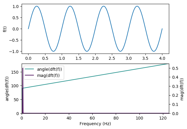
We can see that the Forier transform is telling us exactly what we expect: all the frequency content of the
signal is focused at a single point. What about something like a square wave?
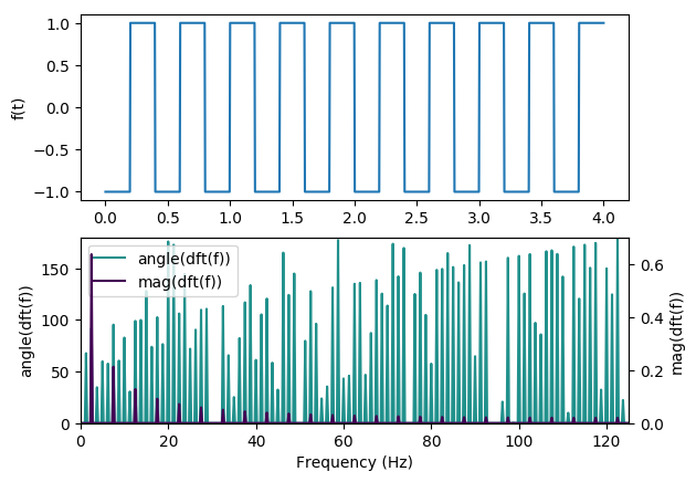
There are a couple interesting things to note here. First, there is clearly a pattern in the DFT. This pattern
can be described quite elegantly mathematically, and I encourage anyone who is so inclined to read up on that
(and the Fourier transform itself). Second, note that the frequency axis ranges from 0Hz to 250Hz. This is because
the discrete version of the Fourier transform can only give us information about the spectral content up to half of
the sampling frequency (which is 500Hz here). If you’re interested in why this is the case, check out the wikiepdia article on the
Nyquist rate. The final thing to note is that I have been plotting three lines on these plots: The
signal itself on top, and then two components of the DFT. Those components have been labeled
mag(dft(f)) and angle(dft(f)). This is because the Fourier transform actually produces two pieces of
information about the sin waves that compose a signal: the magnitude (amount) of each sin wave, and
the phase (offset in time) of that wave. By leveraging both of these components, you can build
much more sophisticated DSP systems chains than the ones we will be building today. Before we
wrap up this section, I’d like to take a brief moment to go over the code I used to generate these
plots.
The first thing we need to do is import all of the tools we’ll need:
The fft stands for “Fast Fourier Transform”, and is essentially the DFT we have been discussing. We also
need to generate our signals:
t = np.linspace(0, 4, 1000)
fx = np.sin(t * 2 * pi)
Then we need to compute the different statistics we’re interested in from the Fourier transform
A few minor details:
- We use rfft here because our signal only contains real values. If you don’t know what that means,
no worries. Just know that it will save us some cleaning up of the output later. - We compute the magnitude of the outputs using np.abs. This has to do with the fact that the output
of the Fourier transform is actually a bunch of complex numbers. We also divide by the length of the
input signal for normalization purposes. Again, the details don’t really matter too much here. - Numpy has a convenient function for computing angles from complex numbers, so we just use that.
The deg=True keyword argument simply tells NumPy to output the angles in degrees, for more
intuitive plotting.
Now that we have something of a foundation, let’s take a look at how we might go about using this tool to
analyze some music
3 Musical Analysis
To start with, we load some music into our program. I’ll be working with Rogers & Dean – No Doubt (Rival x
Cadmium Remix) which is an electronic piece, released for non-commercial use by NoCopyrightSounds. I have
chosen this piece because it has a number of distinctive features in the soundscape, and a strong baseline which
should help our beat detector. First, we should load up all the data we’re going to need, and clean it up a
little
import numpy as np
fs, signal = wavfile.read(‘song.wav’)
WINDOW_SIZE = fs // 8
# colapse all the channels
signal = np.mean(signal, 1)
# Normalize to [-1, 1]
signal = signal / (np.max(np.abs(signal)))
The most obvious thing to do right now is to simply take the DFT of the whole piece.
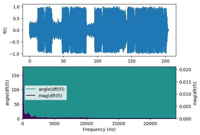
Unfortunately, that doesn’t provide us with terribly useful information. We can see that the phase content
is all over the place, and the magnitude data is not terribly interesting: it mostly just looks like a
decaying exponential function. Instead of taking the DFT of the whole song, it’s much more common
to take the DFT of small sections of it at a time. Sometimes it’s useful for the chunks to overlap, but we won’t be doing that here just for
conciseness. We will divide the song up into 1/8th – second
chunks using the following code:
signal = np.pad(signal, ((0, WINDOW_SIZE – (len(signal) % WINDOW_SIZE))), ‘constant’)
windows = np.array(np.split(signal, len(signal) // WINDOW_SIZE)).transpose()
We can then take the DFT of each chunk:
and then plot all of these as a big image:
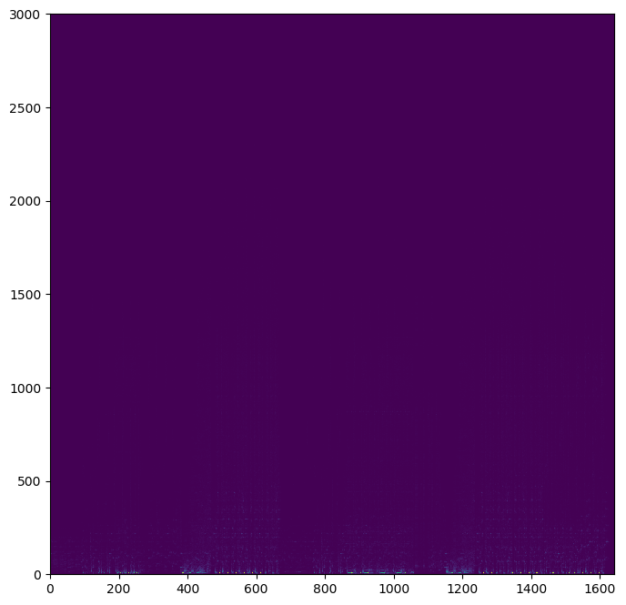
Here we can see the hints of some interesting things going on along the bottom of the image. However, it
initially appears as though most of the image is empty. To demonstrate that this is not the case, I
have provided a plot with some of the horizontal and vertical lines extracted. The magnitude is
plotted in purple for all of charts, while the angle is in blue. The charts are arranged so that the
bottom-most line chart corresponds to the lowest line, and lines are parallel with the chart representing that
slice
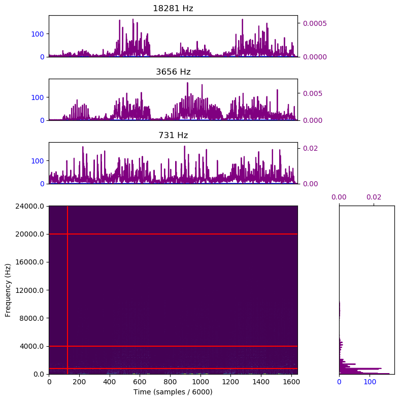
Note that as we go up through the frequency spectrum, the magnitudes decrease exponentially. This makes
sense given our source of data – music. While the precise sensitivity of the human ear to different frequencies is
not precisely known (and may in fact depend on the overall spectral content of the signal, creating a highly
complex and nonlinear dynamic) we are fairly sure that it is at least roughly sensitive to the logarithm of the
incoming energy. We would like to make our magnitude values “perceptually linear”. That is, we would like to
apply some function to the magnitudes at each frequency to make an increase in magnitude at any frequency to
result in the same perceived increase in loudness to the sound at that frequency. To do that, we’ll apply the
transformation below
freq_scaling = np.linspace(0, fs / 2, normed_spectral_content.shape[0])
# Magic to make numpy happy
freq_scaling = freq_scaling.reshape((sample_size, 1))
# “Perceptually linear” version: log of the incoming energy
# We also add a tiny offset, just to avoid dealing with entries
# that have zero energy
pl = np.log(freq_scaling * normed_spectral_content + 0.0001)
This gives us the graph below:
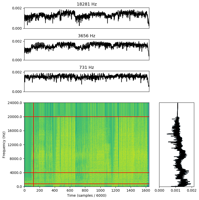
Note that we dropped the colors for the supplementary charts. That’s because we discarded all the phase information when converting to perceptual linearity. However, we did gain quite a bit of dynamic range in the process. unfortunately, due to the length of the waterfall plot, we can’t really see
the fine detail we might be interested in. I’m going to zoom in on just a handful of the samples near the beginning of the piece so we can get a
more detailed picture. The vertical line is still in the same place, relatively speaking:
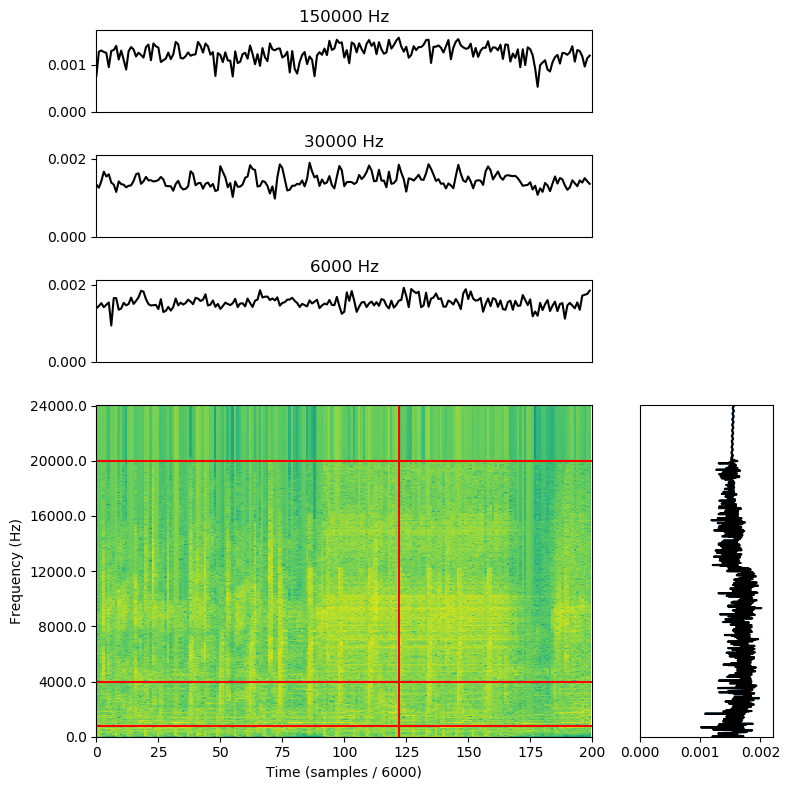
And now at last, we can see the feature we’re looking for: the beats (those vertical stripes of bright yellow).
4 A Really Bad Beat Detector
To finish out this post, we’re going to build a really bad beat detector. Hopefully the techniques presented here
will help you develop your own, less terrible, beat detector (or other music-reactive project). The first thing to note is that we
are going to be heavily summarizing the data; we must collapse the data from over 3000 measurements
per time slice to just one bit: is there or is there not a beat start here. To start, we will summarize the amount of “loudness” in the “low”,
“mid”, and “high” bands. This will give us a number of time-domain signals which, when all of
them cross a given threshold, indicate beats. Putting this all together, we get the following bit of
python:
# Our buckets will be roughly:
# 0 – 100 Hz
# 101 – 2 Khz
# 2Khz – 20Khz
div1 = int(sample_size * (100 / (fs * 2)))
div2 = int(sample_size * (2000 / (fs * 2)))
SEG_START = 100
SEG_END = 300
def summarize(start, stop):
# Select the right part of the array
tr = np.sum(pl[start:stop,SEG_START:SEG_END], axis=0)
# Compute a moving average (window size = 16)
# to smooth out measurements
MA_SIZE = 3
tr = np.cumsum(tr)
tr[MA_SIZE:] = tr[MA_SIZE:] – tr[:–MA_SIZE]
tr = tr[MA_SIZE–1:] / MA_SIZE
# Normalize the moving average
mi = np.min(tr)
ma = np.max(tr)
# Normalize TR
tr = (tr – mi) / (ma – mi)
return tr
sum0 = summarize(0, div1)
sum1 = summarize(div1, div2)
sum2 = summarize(div2, –1)
We can see how well this works by looking at the plot below:
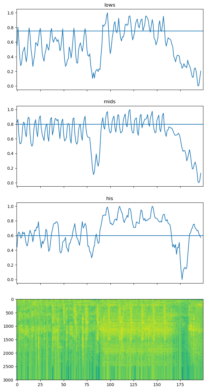
So we can see that a simple threshold approach might work, assuming we set enough thresholds with enough
bins. However, we then run the risk of over-tuning our algorithm on this specific song. If we look
back at the plot of just the raw time-domain signal, we can see that the overall magnitude of the
piece varies significantly. That variance is at the root of the problem here: the varying volume means we need
to also vary the threshold for what is considered a “beat”. This can be accomplished using digital
implementations of things like envelope followers. If you want more detail about that approach, check out this beat detector from
Rice University.
5 Conclusion
This blog post is getting really long, so I’m going to wrap it up here. Hopefully you have at least
glimpsed the power of the Fourier transform, and have some desire to learn more about it. There are
thousands of different filters and algorithms out there, but at the end of the day they all come down to
what we did here: munging about with the data in the frequency domain. Some algorithms, like
FIR filters work only in the time domain, but hidden behind that facade is a frequency-domain
transformation. Doing things in the time domain directly can be more efficient, but it’s usually harder
to figure out what’s going on and is a less general approach. With the Fourier transform, we can
directly inspect the frequency content of signals. While I didn’t have a chance to talk about it today,
the DFT is actually invertable: you can reconstruct the original signal from its DFT. Several data
storage formats, including MP3 and JPEG, actually use a close cousin of the DFT (the discrete
cosine transform or DCT) to compress data. If you want to learn more, this online course is a good
resource.
All the code for this article is available here, on github.